Making moves
with WeTransfer
OVERVIEW
WeTransfer is a global SaaS company with over 89 million active users worldwide and a suite of products designed to ease the creative workflow. I worked alongside the internal team to articulate WeTransfer’s product positioning and set the strategy, content architecture and messaging.
CLIENT
INDUSTRY
Technology, SaaS, Sustainability
SCOPE
UX copywriting
Strategy
Tone of voice
The challenge
Research & understanding
As products, transfer and portals enable much more than just the transfer of files and the sharing of creative work.
Alongside the product marketing manager, I carried out series of 35 user behaviour mapping studies with the aim of understanding user pain points when it came to the product pages. We asked 35 users to individually guide us through their logic when on each product feature page. Users were asked to perform three tasks, whilst walking us through their assumptions, understanding and thought processes and sorting information through a card sorting exercise.
After collecting the data, we performed our own theme sort and a priority map to organise the data in a logical way and work out the priorities and next steps.
What we discovered from the data, was that there was confusion about the product messaging, which led to confusion in the users’ theme sorts, including a lot of duplication. We also gathered from their language that users were also unaware of several fundamental benefits of Wetransfer’s tools, from collaboration to reviews, and that – especially for portals – users were struggling with some of the language around the products.

Jo, 29
Designer, Mother
Jo’s busy lifestyle means she wants a reliable, fast and efficient solution for file sharing. Her job requires her to transfer files around the world to her team, whilst collaboration closely with clients. WeTransfer could be the solution Jo needs to move her ideas from A to B, whilst collaborating efficiently with her team. 💫 🚀
KEY INSIGHTS
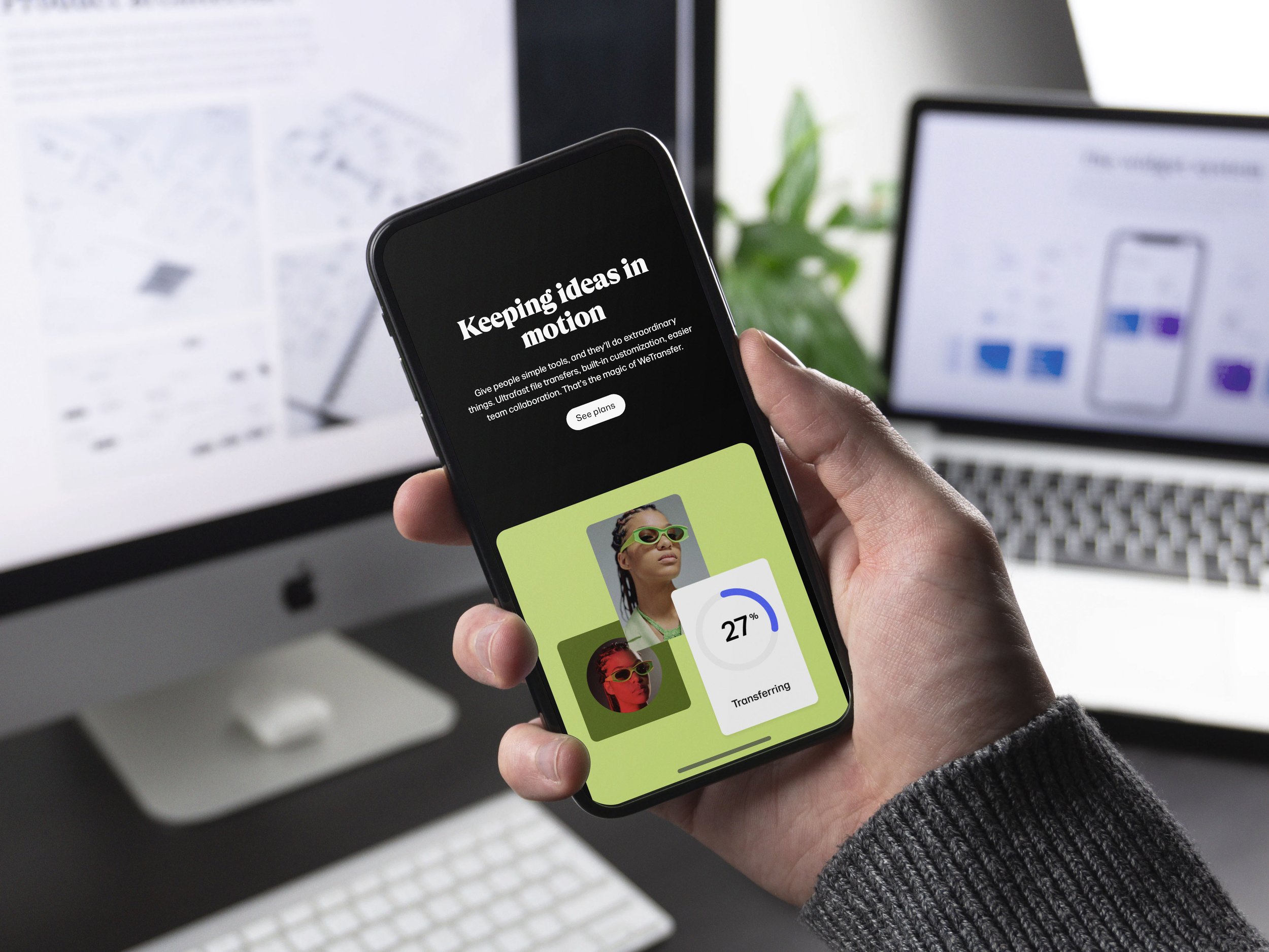
If nothing moves, nothing changes. From files to ideas, and projects to passions, We enable sharing, movement, opportunity.
STRATEGY
We knew we needed to break through category tropes of “transfer” and create pages that felt as unique and story-led as our audience.
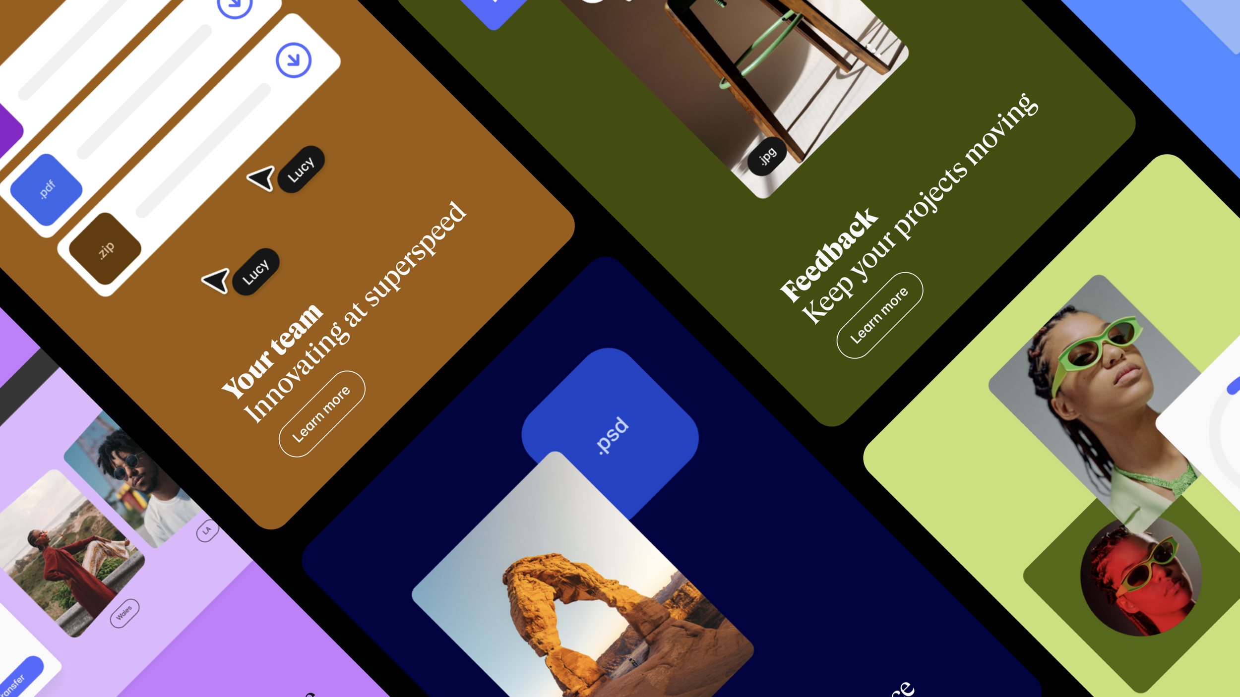
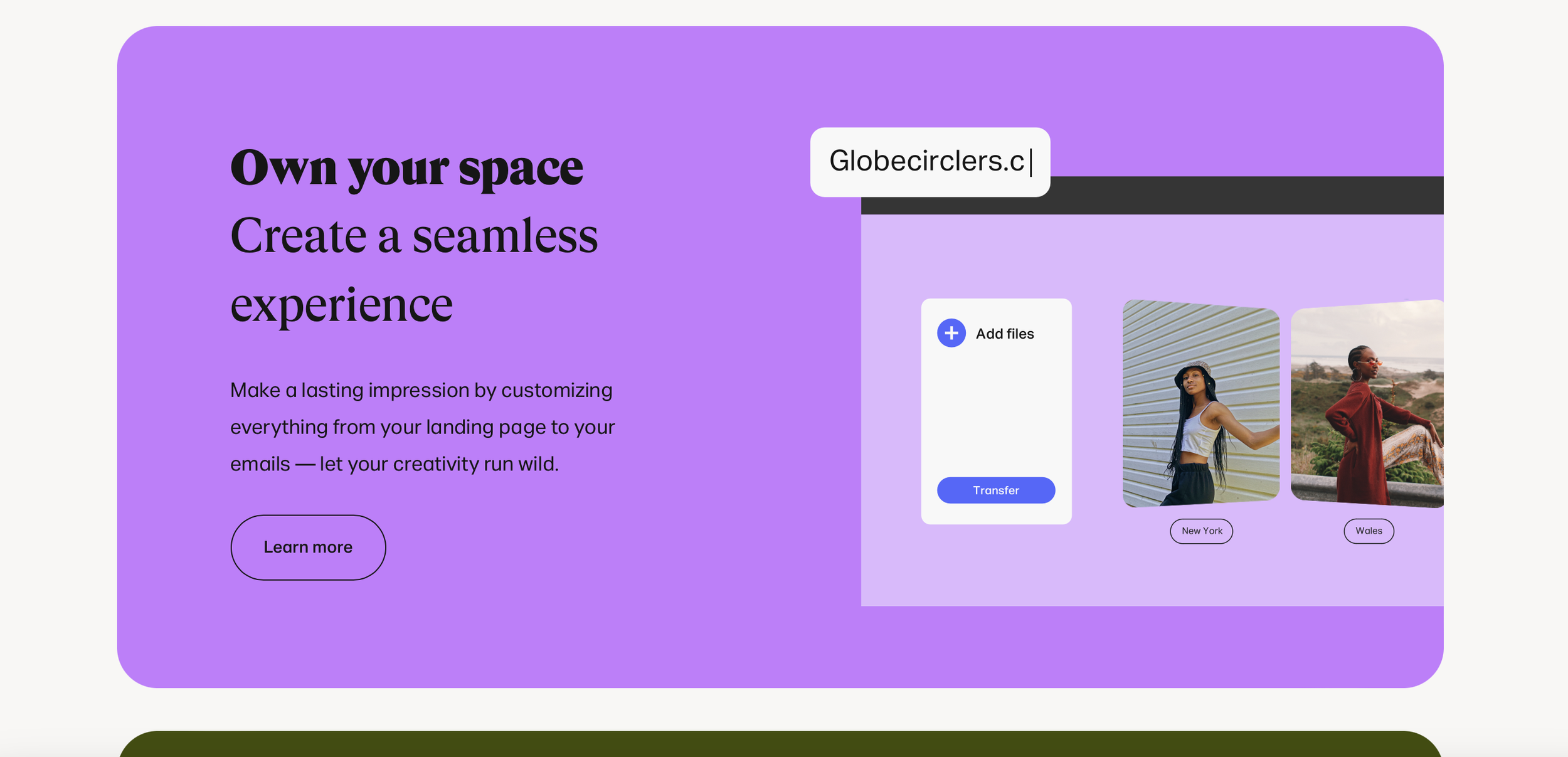
Using a mixture of our own logic and that gathered from the user mapping, team collaboration and historic data, we went with the concept of “show, not tell”, using product-led storytelling to communicate what WeTransfer enables beyond fast transfers. Effortless collaboration means more time left to create, make, and grow. Fast file transfers isn’t just about “files” – it’s about helping people share whatever they want to share – work, creations, songs, ideas – effortlessly, freeing up time to focus on the things that matter.
The messaging evolved from functional to aspirational, moving up the abstraction ladder from the “how” to the “why – communicating how the products can be used, and why using them will improve your life.
I worked alongside a talented UX designer to implement overarching narratives for each page for phase 1 and 2. We faced several limitations from the developers when it came to the page structure, as well as a tight word limit. It’s easy enough getting the key concepts down, but whittling them into a two-line sentence that effectively educates and inspires – well that involves a significant amount of trial and error.


Working with the HR, design, and leadership teams to create a brand new careers page for WeTransfer.
Danilo Tesi, Product Marketing Manager, WeTransfer
“Sarah has been incredible to work with. From competitor and user research to turning insights into clear, beautiful comms across various marketing pages, Sarah was involved in every step of the design process. Layered, thoughtful, and to the point, while representing our brand beautifully.”
Ready to stand out?
It all starts with a chat.